Challenging the balance between security and usability
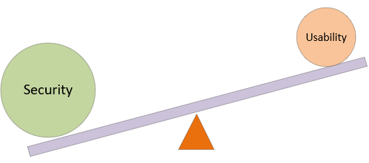
It is a well-known adage in cybersecurity that there is a balance between usability and security – if you increase the security and control, you decrease usability. Conversely, to make a system user-friendly and easy to use, it has to be done at the cost of lowering security. This has been a well-known concept within systems design, and it has become so ingrained into the psyche of security designers that it is never challenged. There is however a fallacy that if you increase security, that you inherently decrease usability, so now the time has come for challenging the balance between security and usability.

Challenging the usability/security balance
Now has come the time to challenge the balance between usability and security. Security and control is a definitive measure – something that can be quantified independently, and measured against industry standards and guidelines. You can measure the security of a system through penetration tests, independently review and against best practice, or through the use of vulnerability scanners.
Usability is malleable
Whilst security is definitive and measurable, usability is a matter of opinion and mouldable. How usable a system is will largely depend upon what the user’s skill and experience is. A simple task like registering an OAuth connection with a social media account may be very usable for some, but a big challenge for others. Therefore, usability is not inversely correlated with security, instead usability is co-related to training and using a common interface language.
Common interface languages
In a more heavily connected world, a common language has evolved for interfaces. We no longer get an instruction manual, as the common elements of an interface are known by almost anyone.

This common knowledge also applies to security challenges. The CAPTCHA, the SMS code, cookie permissions and app permissions, all are widely understood by users and no longer swing the balance of usability down. Even errors and problems are widely understood by users, and they have become used to timeouts or error messages where they can re-try or even online chat with support. This understanding of the language of [secured] systems means that the skills and understanding is higher.
Why security
Security needs to be in place to stop bad things happening, to keep data secure, stop invalid people from coming in, and to keep the system running. In days gone past, security used to be a “layer” on top of a working product, but now security is inherent and pervasive, it is at every level of a system from the room that holds the hardware, right up to the login page and around every interface. In older systems, when security was bolted on after the product was working – it was inherently a limiting factor, decreasing usability. But now security is – and needs to be – everywhere and throughout, considered right in to the design.
The new balance
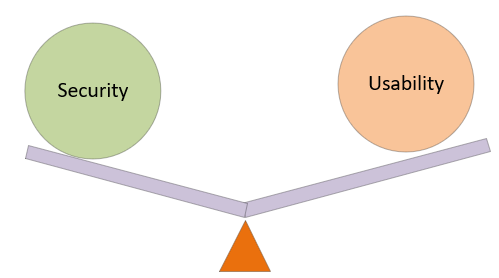
Whilst there is still some balance between high-security and usability by uninformed users, we can improve usability through system design and user training. A challenge to balancing security and usability is that we can increase security to a higher level before the usability beam starts to lower. The new balance is to find the very highest spot where security can be raised, before the usability moves into new territory that users are not experienced in.
